Sunday, 2 April 2017

Design of the Design Course

In my final blog post this semester, I will be talking about a concept that stood out to me from this course.

When I come across a website, an application, or something similar, I automatically make judgments about it. Judging is my hobby clearly. I tend to notice certain things that the interface does or does not do well. It is sort of intuitive. It just 'feels' right or wrong. I have experienced this several times and it was good to learn that there are a set of "laws" that determine what constitutes good design and unofficially govern what makes a product good or evil bad.

Laws is not the best word to use in this regard. They are more like a rule of thumb to follow to achieve to help find a useful if not ideal solution; better known as heuristics. For instance, a heuristic in tic-tac-toe is play in the middle. It's a strategy that doesn't guarantee winning but rather increases the probability of winning. In the field of interaction design, a heuristic is a general idea to follow to help achieve more usable and better looking interfaces.

Jacob Neilsen defined the following heuristics in 1994 and they are still used today.
  1. Visibility of system status
  2. Match between system and real world
  3. User control and freedom
  4. Consistency and standards
  5. Error prevention
  6. Recognition rather than recall
  7. Flexibility and efficiency of use
  8. Aesthetic and minimalist design
  9. Help users recognize, diagnose and recover from errors
  10. Help and documentation 
An important ability to have in the field of UX and more broadly, computer science, is the ability to look at an interface and determine what its strong points and shortcomings are. Heuristics help narrow the search space and thus make it easier to find problems with interfaces. But this is only one aspect of the heuristics. Once possible errors are found, a person should be able to precisely describe why the heuristic is violated. This aspect of the course has helped me hone this particular trait and has more importantly taught me the vocabulary to talk about it. Additionally, I got a chance to talk about different topics in UX via my blog posts and this too helped me improve in this aspect. The ability to find flaws in an interface is usable in nearly every field of computer science and is definitely a good tool to have.

Monday, 20 March 2017

Font does matter

Fonts matter. That was the takeaway message from class this week. We first had a brief history lesson on the origin of fonts and the reasons they were designed the way they were. The easiest distinction between fonts is serif vs sans serif. Serif fonts are those that include lines at the end of letters. They were drawn in to prevent marble or stone slabs from breaking right through when letters were carved on them. It took away the stress. It also provides for a place for the overflow ink to go. The default font on Blogger is Times which is a serif font. You can tell by the T... T The line on the bottom of the T and the pointy bit on its left and right end give it its 'serifness.'

The other type of font is sans serif or no serif. They are named (you guessed it) for he lack of lines or pointy bits at the end of letters. This is an example of a sans serif font. Note the T.


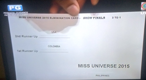
So fonts matter and people get very upset when certain fonts are used. For instance, just the mention of Comic sans riles some people up. I personally don't have much of a reaction to different fonts. The most important thing for me is legibility. Another thing to take into consideration is the design. It is one thing to have the right font and another to make sure that it is visible and easy to read and understand. For an example of what not to do, I present the infamous Miss Universe finals.


There are a couple of issues with the design of this card and none of them have to do with the spelling of 'elimination.' Firstly, the information about the 1st and 2nd runner up are in the middle which is the most prominent part of the card. When looking at something like this under pressure and with no time like Steve Harvey did, the eyes immediately filter information. The middle of the card would be important and it would be easy to ignore 'Philippines' because the font is so small and near the corner of the card. It's easy to imagine that Steve saw 1st and Colombia in the same line and came to the wrong conclusion that the winner was Colombia. Also, for whatever reason, the card is not aligned. Did the creator of this card accidentally hit right align for the winner? The following is  much simpler and cleaner design that is significantly easier to read and interpret.

Miss Universe 2015 Results


2nd Runner Up: USA

1st Runner Up: Colombia
WINNER: Philippines

Now this would be much easier to read... even in comic sans.

Bibliography

https://www.reddit.com/r/funny/comments/5bjth1/fonts_matter/
http://olaitankolawole.com/take-a-look-at-the-design-of-the-miss-universe-card/

Sunday, 5 March 2017

Microcopy

Microcopy is small text - often a sentence - found on many websites that contain information to efficiently navigate the website. Bill Beard from the UX magazine Smashing Magazine states that, "it’s the little text that can make or break your user experience." It is most commonly found on forms. Another common location is sign up sheets, loading screens and error messages. Examples of microcopy are the "Forgot Password" messages/links at almost all sign-in forms. These subtle additions significantly elevate the user experience.

For instance the use of microcopy is evident from a screen grab of the Smashing Magazine article 5 Ways to Prevent Bad Microcopy. The right side of the screen contains a section to subscribe to their newsletter. Microcopy contains important, relevant information such as how frequently the newsletters are sent, how to sign up, and the number of people who have already subscribed. 

Another simple example and personal favourite of mine is the Google Chrome page when not connected to the internet. The dinosaur is a metaphor for a time without technology and is equating no internet to it. Secondly, it's a game which gives the user something to do while waiting for his/her laptop to connect to the internet.

Too many hours have been spent playing this game
The use of microcopy is common on loading screens or menus and the following are just samples from some of the games I have on my phone and one from Top Hat.

Reference to the in game currency


War and Peas...

Other common military-ant activities are also used


Microcopy can be used to insert witty text to make light of an error such as the Google Chrome example or to make the site more lively and entertaining as a whole. Inserting such text is an easy way to transform a dull site without a lot of effort. Dull error messages too can be replaced with more interesting messages that convey the same information. They can also be used tongue-in-cheek or with a lot of sass to draw a smile on the user. For instance, the timeout message on 9gag.

I need messages like this when I am doing homework

Or this passive aggressive message from Netflix

I don't need you judging me Netflix
Or the witty messages from Tumblr


Strictly speaking, microcopy does not have a lot of practical value. Websites can still be navigated without it. However, it makes it considerably easier and more enjoyable for the user. It is like a paint job on a car. It doesn't improve the performance in any way but it looks a whole lot better.


Bibliography

https://www.smashingmagazine.com/2013/06/five-ways-prevent-bad-microcopy/
http://scalar.usc.edu/works/netflix-culture/are-you-still-watching
https://uxdesign.cc/the-magic-of-microcopy-a56c5decbe1f#.7hx5896ki

Sunday, 19 February 2017

Fruitful Metaphors

A couple of weeks ago in lecture, we spoke about the use of metaphors in the tech field. A metaphor is “a term or phrase applied to something to which it is not literally applicable in order to suggest a resemblance.”

It reminded me of a sketch that I watched a number of years ago and like many sketches these days, it was fairly easy to find on YouTube. 

                                                                                                                        
You simply have to appreciate the cleverness of this skit. There are so many jokes and subtle play on words that one might miss them on the first watch through. The skit begins with a customer expressing disappointment in an item he bought from the store - his blackberry is frozen. In this case, the store is a grocery and the blackberry in question is not a phone but rather the fruit. The fruit is literally frozen (cold) a metaphor that in the computer world refers to a program that does not respond to user actions. The store owner asks if it has run out of juice. The pun here referring to juice from a fruit and juice which refers to battery life.

The store owner proposes to try the blackberry on Orange and literally places it on top of an orange. This joke eluded me until I scrolled down into the comments section. Orange is a mobile phone provider in the UK and the owner was trying to get the blackberry to work on this provider. This leads directly to the next joke - the black spots on the orange. Black spots is another term used in the tech world to refer to places with no phone coverage. In the skit, there were actual black spots on the orange. On a side note, I wonder if there is a reason that computer scientists are fascinated by fruit - Blackberry, Apple. 

The next segment talks about troubleshooting and references moving the blackberry to different places but the customer complains that all that accomplishes is mess the windows. Windows obviously a pun on glass windows and the OS. The store owner suggests waiting for the latest version of the blackberry. This is another common element in the field of technology. Technologies constantly change and latest versions of a product are released almost yearly or sometimes more frequently. The customer then asks for a date and is promptly handed the fruit. There are no direct connections to technology here but it's funny nonetheless.

The customer also has a problem with his apple. Again, fruit not iDevice. The owner comments on how old it is noting that, "two new versions have already come out!" Apple, the company is infamous for frequently releasing newer versions of their products. Apple is also infamous in its requirements for cables. The change of the charging cable for their iPhones and now the removal of the headphone jack were both hotly debated changes. To be fair, the skit was released before these changes were implemented but the idea of connecting extra cables to computers have been around for a while. The video pokes fun at it by the customer stating that he could not figure out how to connect a dongle to the apple. According to Merriam-Webster, a dongle (apart from being a fun word to say out loud) is "a small device that plugs into a computer and serves as an adapter or as a security measure to enable the use of certain software." 

The skit concludes with what is in my opinion its best joke. The customer asks for something for his grandson and the owner recommends the 'Eggs-box' which sells for 3.60. This is a play on Microsoft's Xbox 360. In this case, a box of eggs stands in for the console. 

The difference between the literal use of a phrase and a metaphorical use of a phrase is apparent in this video. Many actions relating to computers or technology use in general rely on metaphors. In most cases, it is easy to know exactly what a metaphor is trying to convey and a metaphor is an apt way to describe the nature of that specific task.

Bibliography

  • https://www.youtube.com/watch?v=kAG39jKi0lI&spfreload=5
  • https://www.merriam-webster.com/dictionary/dongle


Saturday, 4 February 2017

(Lo)Go Science!


I have always been fascinated by science, and more specifically by new discoveries and how they were made. So you could imagine my joy when I found out that U of T had a course on the history of science. The course covered famous scientist, their discoveries or ideas and the impact that they had on the world. Recently, I came across a picture that caught my attention. The picture was titled, "If famous scientist had logos." 


I thought that the picture was ingenious. Each scientist's name was displayed but it included a clever addition to it based on what they were famous for. It reminded me of what our lecturer mentioned in class about the Evolve game logo. At first glance, it seems insignificant but when you think about it, you can see the deeper meaning in the logo. The Evolve logo had the 4V1 - EvolVe to represent 4 humans against one monster. The size of the block that contained the letters were the same and this represented that they were evenly matched. The essence of the game is given merely by that picture. Here is a brief explanation of what each logo in this image means:
  • Pythagoras - The A is a triangle; the Pythagorean theorem
  • Archimedes - "Give me a lever long enough and a fulcrum on which to place it, and I shall move the world." His name is like a lever balanced on a fulcrum
  • Copernicus - Earth's orbit around the Sun 
  • Newton - The falling apple; gravity
  • Darwin - Evolution
  • Einstein - E=mc^2
  • Democritus - Atoms. He was the first to suggest atoms
  • Euclid - His axioms and postulates on geometry
  • Leibniz - Integration - the notation for it
  • Godel - Incomepleteness theorem, his name is incomplete
  • Faraday - Magnets
  • Bohr - Atomic structure
  • Pauli - Pauli's exclusion Principle
  • Heisenberg - Uncertainity
  • Feynman - Path integral formulation
  • Borlaug - Work in agriculture, wheat
  • Crick + Watson - DNA molecule
  • Goodall - Research on monkeys
My particular favorite was Einstein's logo. It took a second to realize that the mc^2 was equal to E and his formula seemed to work perfectly with his name. Creative UX logos like the following are memorable. They leave an impression on the user that (lo)goes with them where ever they may be. It also increases the likelihood of a person mentioning the logo and sharing it with their friend which in turn bring greater attention to the product or person. And if nothing else, you can appreciate the genius of the artist!

Image from: http://imgur.com/gallery/6EFm4hS

Saturday, 21 January 2017

Pokemon Go or What Not to do When Releasing a Product

2016 will be remembered for the seemingly higher number of celebrity deaths, the election of Donald Trump, the popularization of the dab etc. It was some year... Another event it will be remembered for was the release of the mobile game Pokemon Go.

Pokemon Go was a smash hit when it was released, amassing downloads like never seen before. Here in Toronto, it seemed that you could not walk down the street without bumping into someone hunched over their smart phone looking for Pokemon. There were Pokemon Go parties and users of the game congregated at Harbourfront. The Ferry Terminal was home to a number of Pokestops and became the go to place for Pokemon Go users. Hundreds of users gathered there dropping lures to a point that the Mayor requested Niantic to remove some of the Pokestops.

The game had hooked the imagination and the wallets of its users. However, Niantic failed to build on the initial success of the game. They squandered away much of their user's goodwill by taking too long to address many of the issues that plagued the game and ruined the experience for the user.

First and foremost, Pokemon Go was released as an incomplete game. There were several high priority defects that somehow found their way to the final version. Granted, some of these may be due to the unprecedented load on Niantic servers. For instance, the two most basic features of the game - tracking Pokemon and catching them often ran into problems. The tracking feature did not work at all. It simply displayed 3 paw prints next to the image of a Pokemon and this was very misleading. Intuitively, this would suggest that a Pokemon was nearby and one would expect the number of paw prints to go up or down accordingly. Unfortunately this was not the case; and a game that billed itself as a game to track Pokemon failed to get this feature done

But the most frustrating  problem with Pokemon Go was not with the game itself; instead it was with Niantic. Niantic was deathly silent through the chaos of the servers crashing and all the defects with the game. Once the popularity of the game was established, perhaps it would have been prudent to throw a little money at the game and hire a PR team. Or even a PR person. Or intern. You get the idea. Just anyone to login to Facebook/Twitter and inform users about what was going on.

Over the next couple of months, Niantic was able to steady the ship. The tracking feature now works. Catching Pokemon works as expected. They have even released cool new features such as walking Pokemon to get candy. However, I can't help but wonder if the number of users would have been more if they had better handled the initial road bumps. Maybe waiting another month to fix the issues/get their servers sorted out may have mitigated some of these losses.


Monday, 16 January 2017

Hello World

Hello World! Welcome to my blog for CSC318 - The Design of Interactive Computational Media. On this blog, I will write on material ranging from interesting design choices to critiques of designs to human interaction with digital technology and so on. Hope you enjoy reading this and I hope you learn something from it.